
There are currently over 3 billion smartphone users worldwide and that number is expected to rise to 7.49 billion by the year 2025 (Statista). More people are using their mobile devices to search for content or research products and services online. That’s why it’s crucial that you have a mobile-first web design.
But what are the elements that make a winning mobile-first website? And how will it cater to the success of your online presence? You’ll find valuable information about what this type of web design is—and its key elements—below.
What is Mobile-First Web Design?
Mobile-first web design is structuring your site for mobile use first before creating it for desktop devices. The purpose is to create an optimal user experience for people accessing a website through a smartphone.
Developers create mobile-first websites before focusing on use on larger screens because smartphones tend to have less space which could affect how the website operates.
Designers will only use the most important elements for seamless website rendering and navigation. The design is done by sketching out how the layout of the website will look on a mobile device before adapting it to a larger computer screen.

The Importance of Mobile-First Web Design
All businesses big or small that have a website should create a mobile-friendly site. For one thing, Google’s algorithms favour mobile-friendly websites. So, if your site provides an excellent user experience it could increase your SEO rankings and improve your online discoverability.
Additionally, mobile rendered websites can help generate leads and boost conversion rates. It also helps your users focus more on core content such as landing pages.
Creating a mobile-friendly website isn’t simply for you but for your customers to have a pleasant experience. It gives users an intuitive interface that’s easy to navigate through on their smartphones.
Mobile-First Web Design Elements
To create a mobile-first website there are key elements you need to consider. In this section, you’ll discover best practices when creating a mobile-first site for your company.

Keep Users in Mind
You’re not designing a mobile website that’s easy for you to use. When developing your site for smartphones your users must be at the forefront of your considerations when designing. Your website must help your visitors solve a problem quickly so it must be convenient for them to operate.
To create a site that’s easy for your visitors to use, consider interactions they’ll have with your content. You could also look at your competitors’ websites to see what they’re lacking and include that structure and information on your site.
Consider the following when designing your mobile-first website:
- Are the menus easy to read and click on?
- Is it easy to scroll up or down on the website?
- Are your contact details easy to find?
- Are your products and service pages visible?
- Can users click back to go to the previous page?
- Can your users type out messages easily when sending you a message?
The Visual Structure of Your Content
Users prefer not to read long walls of text on websites. Your content must be concise to get the point across very quickly. Eliminate fluff by focusing only on the services and products you provide. Content should also be displayed according to its importance.
Although not all website designs are the same, certain elements follow a similar layout. When designing your mobile-first site consider the following elements:
- Titles should be at the top of your page.
- Add relevant content that’s easy to scan. You can use bulleted lists under titles.
- Divide long paragraphs into one or two short sentences.
- Add a call to action to each product or service.
Value propositions are the perfect example of how to structure your information on your mobile website.

Keep Your Website Streamlined
Professional websites are streamlined with minimal images or design elements. Too many pictures, videos and buttons can make your site look cluttered, especially on a mobile screen. Eliminate visuals that may distract or annoy your users such as pop-up boxes or adverts.
Use simple typography that’s easy to read on a mobile device. Additionally, you should use wider borders and only utilise a maximum of two columns of content. And lastly, create fewer website pages and you have a more smartphone-friendly plan.
Create Emphasis on Your CTAs
A call-to-action button is what drives conversions. It prompts users to buy your products or services and to visit other important pages. Furthermore, use a call to action to get users to subscribe to your website.
Your call-to-action buttons must be bold with bright colours and straight lines, and they should be easy to tap on when using a mobile device. These buttons make your website more attractive and eliminate the need for long links that take up too much space.
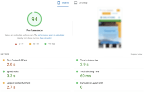
Loading Speed is Crucial
Users will bounce off your mobile website if it takes more than three seconds to load. Additionally, customers that experience poor site performance may not visit or buy from your website again. It can also decrease your Google ranking.
Factors that decrease mobile website speed are large images, too many videos and incorrect optimisation. To increase the mobile speed, you can:
- Load above the fold content before below the fold content
- Measure round trip times
- Measure and minimise server response time
- Place JS at the bottom and CSS at the top of your HTML files
- Use gzip compression to decrease file size
Eliminate Hovers
On a computer, websites have hover control when a user places their mouse cursor over an area. For mobile websites, there is no hover control so don’t rely on this type of interaction with your design. Instead, use an active selector for links and call to action buttons.
Check the Placement of Your Ads
If you are going to include ads on your mobile-first website design, then you need to consider the placement of them. You don’t want the ads to distract your users from the main elements of your layout.
You can follow the Better Ads Standard when you include ads on your website. Placing ads at the top of your mobile site can take up too much space which creates a poor user experience. So, rather consider placing them at the bottom of your website.
Test Your Website on a Real Device
The only way to ensure that your mobile-first website is working is to test it on a real smartphone before going live. This helps designers verify whether it works as expected across all platforms including tablets and computers.
Check all elements such as speed, navigation, and the layout of your pages. While testing the mobile website you can determine if there are any elements you need to remove, add, or fix.
Final Thoughts
Many businesses struggle to create a mobile-first website because they may not have the technical skills for the job. If you’re one of those companies, then Digital Insider would like to assist you! Our team has the expertise to help you create a winning mobile-first website that will set you apart from your competitors.
Request a strategy with us so we can start developing your mobile-friendly website to boost your online presence and increase your conversion rates!
References
https://www.statista.com/statistics/330695/number-of-smartphone-users-worldwide/